Brand Guidelines
This guide defines the visual language, design style, and principles that ensure a coherent and elevated expression of the BGS brand across every discipline and touchpoint.
At its core, BGS is about precision, integrity, and human-centered innovation—reflecting our mission to advance biological dentistry through science and education. These guidelines establish the visual foundations that bring that mission to life, from color and typography to composition, photography, and digital expression.
Whether you are designing for clinical, educational, or digital environments, this document ensures that every application communicates the clarity, trust, and expertise that define the BGS identity.
Contents
01
The Vision
02
Biodentistry Global Standard
03
Brand Architecture
04
Logo
05
Color
06
Typography
01 The vision
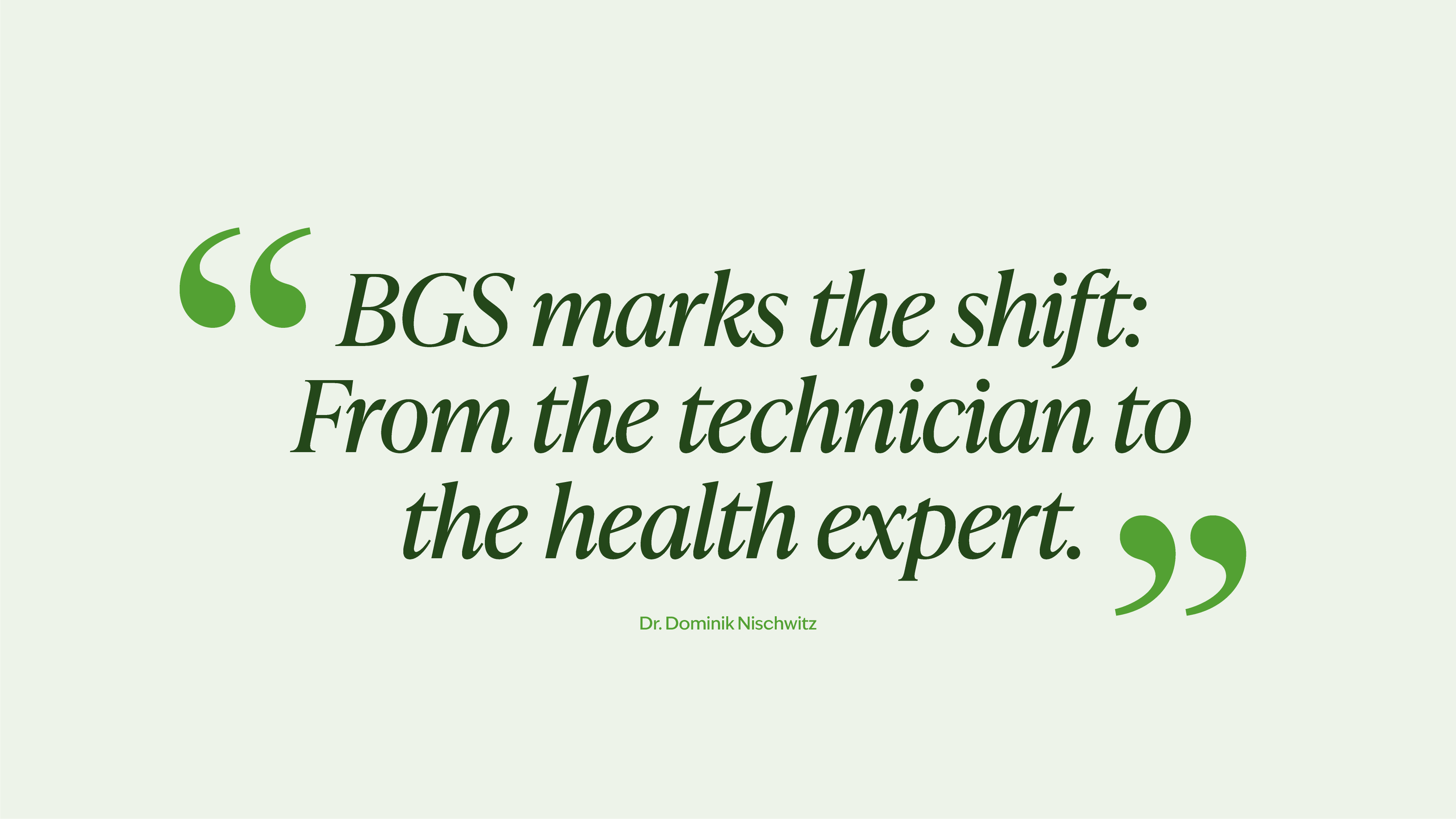
The Biodentistry Global Standard was founded by Dr. Dominik Nischwitz to initiate the biggest shift in healthcare.
What started in one clinic has become a global framework that redefines dentistry as systemic medicine.

Certified Real Biodentists form an expanding web across countries and clinics, united by one enforceable standard.
Our vision: every patient, everywhere, benefits from a health system that starts in the mouth.
02 Biodentistry Global Standard
What is Biodentistry Global Standard (BGS)
Biodentistry Global Standard (BGS) is the global benchmark for biological dentistry.
Comparable to ISO in manufacturing or five stars in hospitality. Every patient knows what to expect. Every dentist knows what to deliver.
Why BGS matters so much
Oral interference = systemic disease triggers.
Metals, root canals, cavitations, toxins → chronic inflammation.
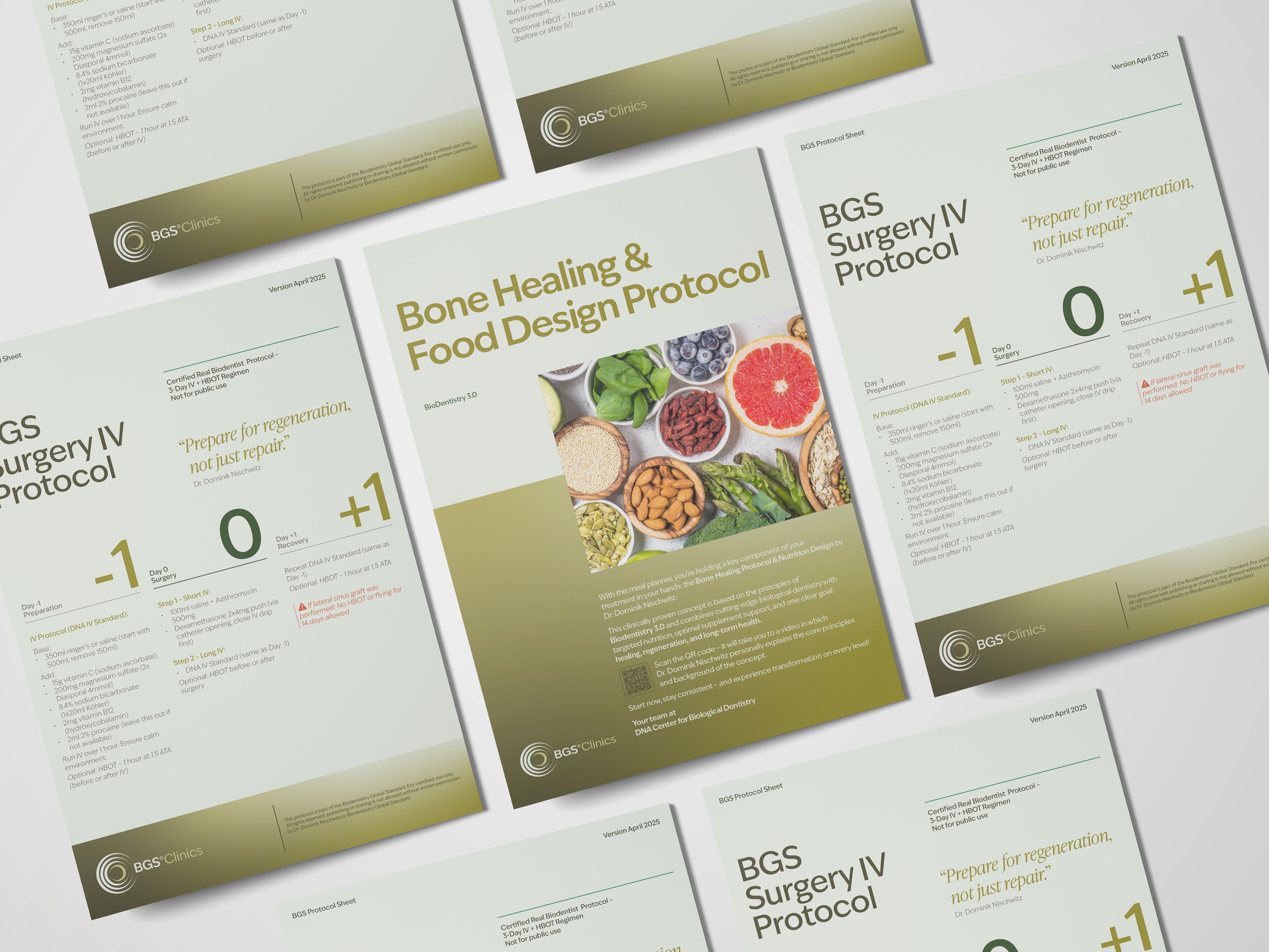
Biodentistry Global Standard is the standard that connects the mouth to total health. BGS transforms dentistry from repair work to systemic medicine.
Dentists evolve from technicians to physicians of whole-body health.
What’s included in BGS
BGS Certified means proof, not promises. BGS non negotiables:
• Metal-free, fluoride-free care
• Safe amalgam/metal removal
• CBCT scans for every new patient
• No root canals (except short-term relief)
• Cavitation diagnostics & treatments
• Ceramic implants
• Nutrition protocols & supplementation
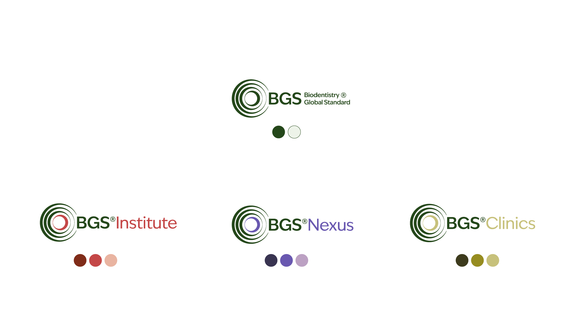
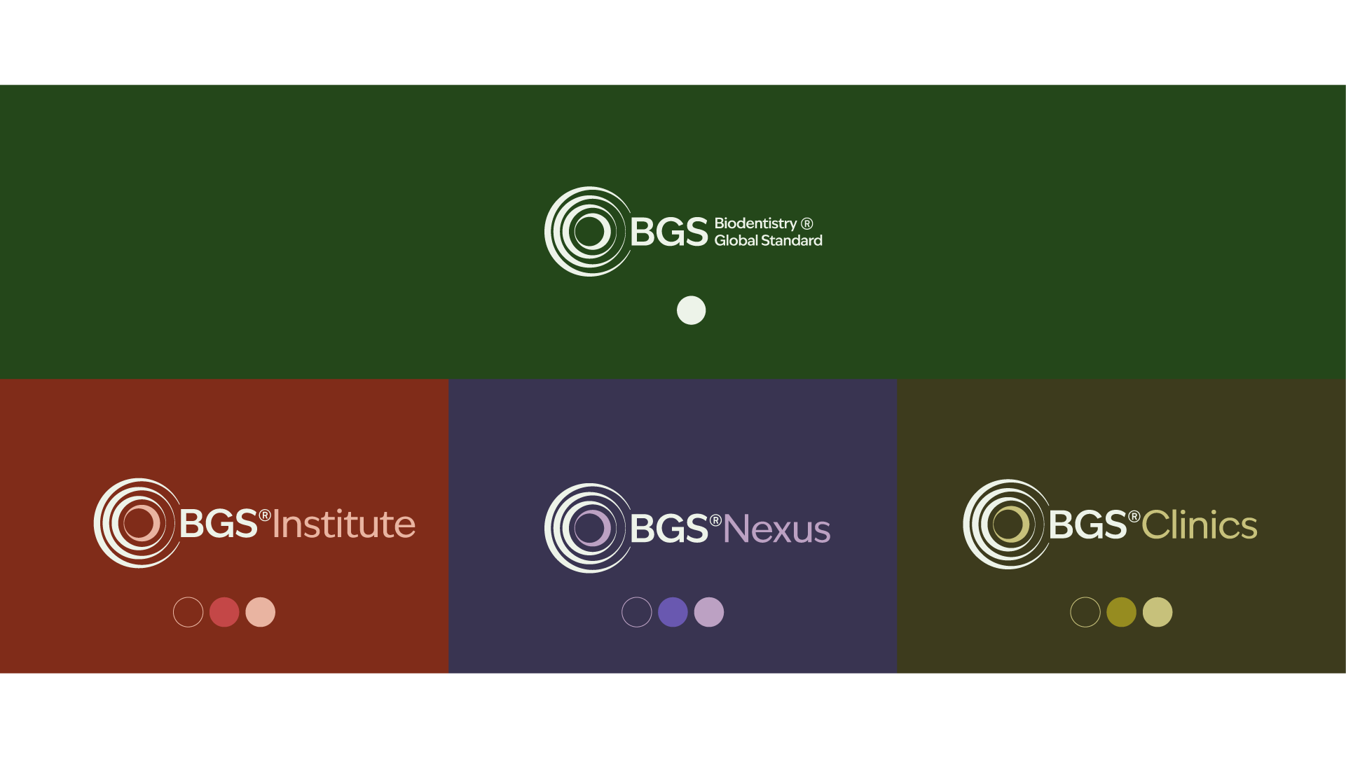
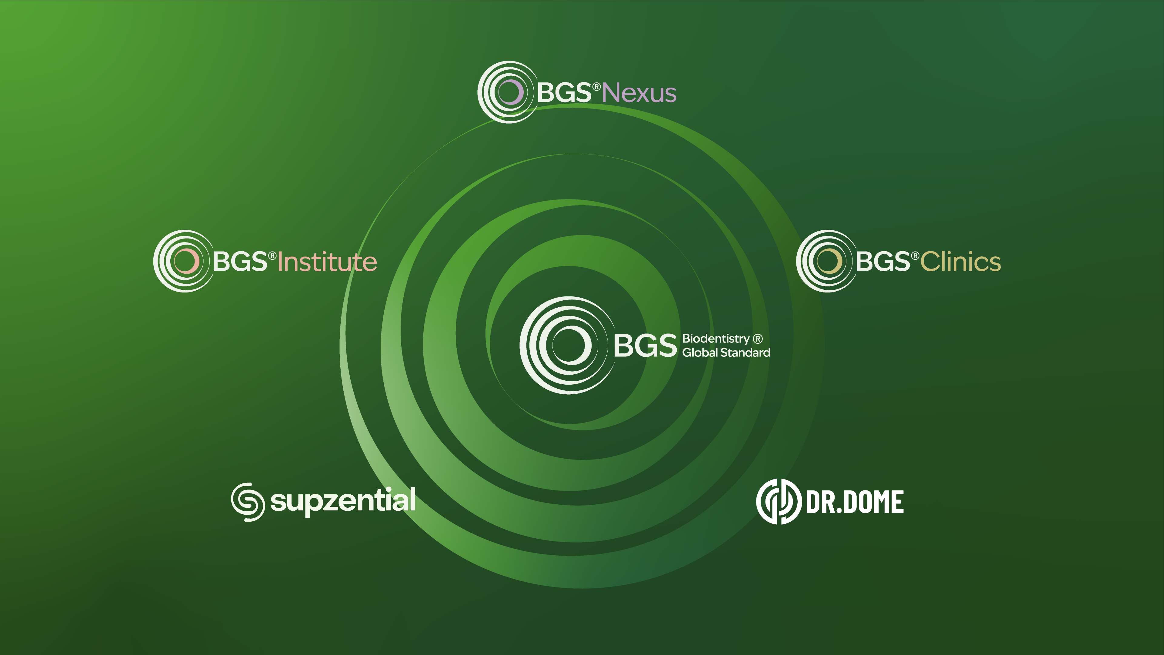
03 Brand Architecture
One standard. Leading to clarity and structure.
Biodentistry Global Standard (The unified global standard and quality seal) → Dr. Dome (the face) → BGS Institute (the certifier) → Supzential (the products) → BGS Clinics (the application sites) carried forth and amplified by the Real Biodentists network
Level Architecture
TIER 1
Certified Real Biodentist Trained on essential certification Biodentistry 3.0. Listed in the BGS Institute Alumni Directory (personal level).

TIER 2
BGS licensed clinic. Listed in the public Real Biodentist directory, searchable by certification level and clinic type, eligible for BGS Global amplification and use of BGS seal.

TIER 3
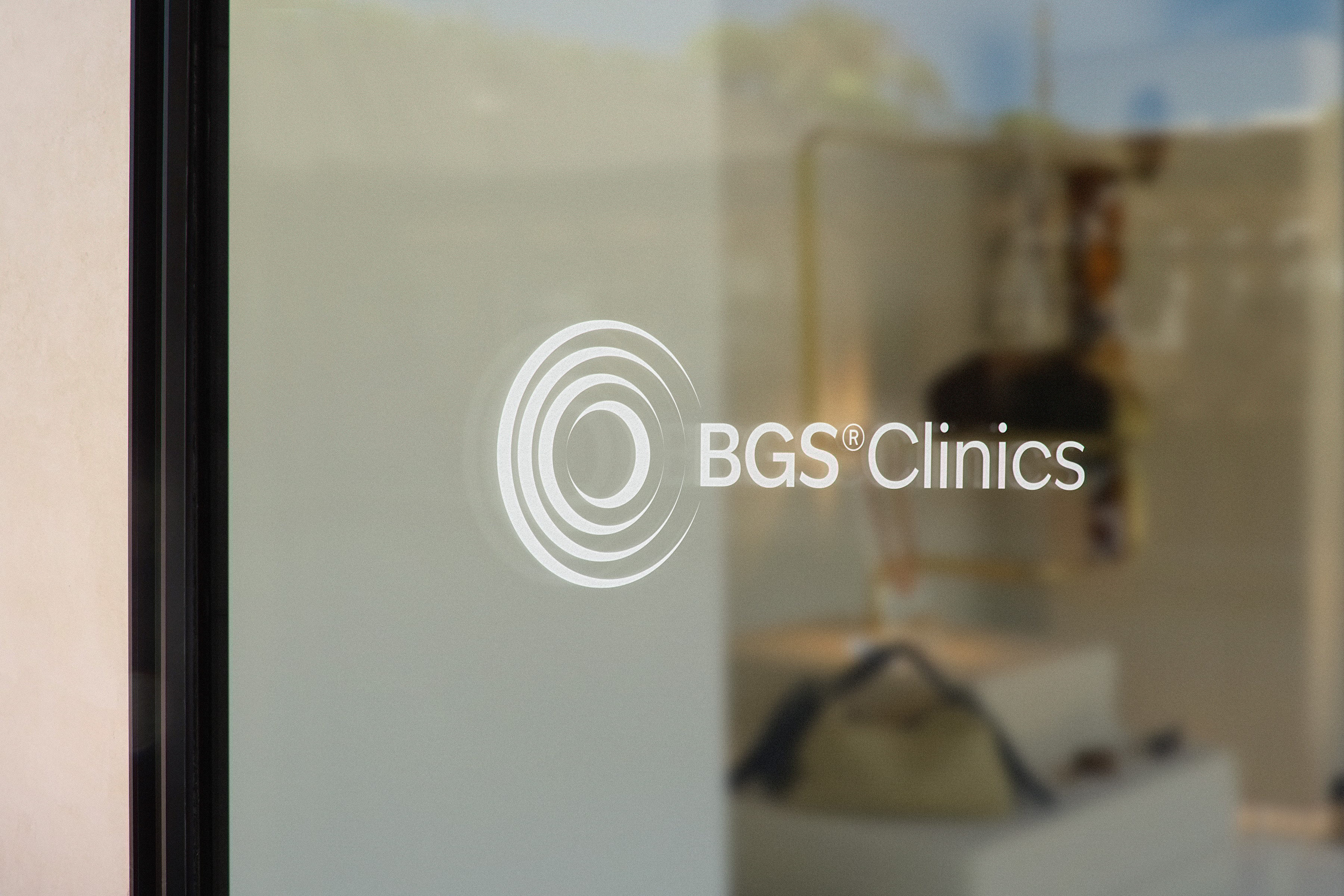
BGS Clinic. Flagship clinic - listed in the public Real Biodentist directory, highest possible level - advanced and BGS training centre.

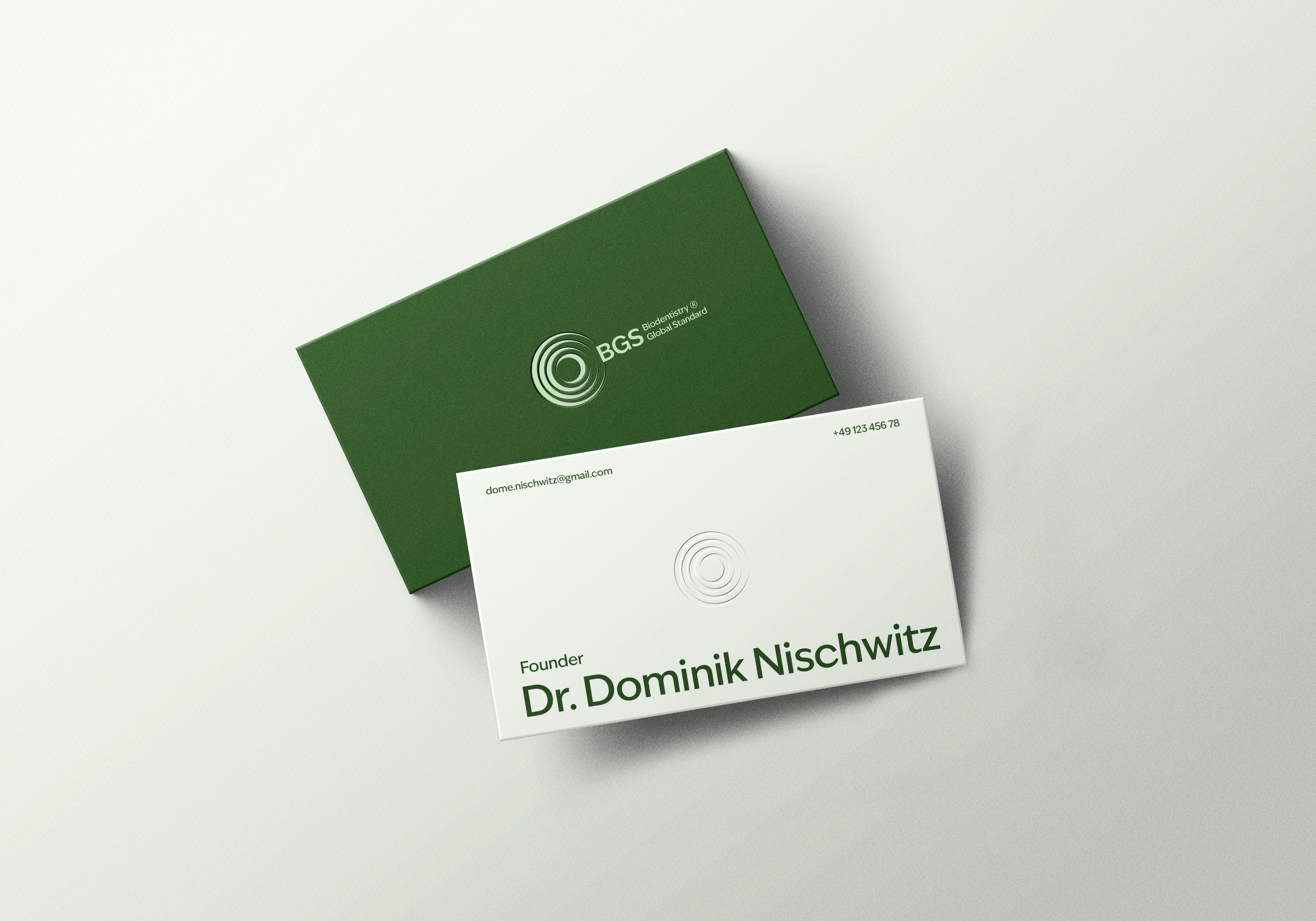
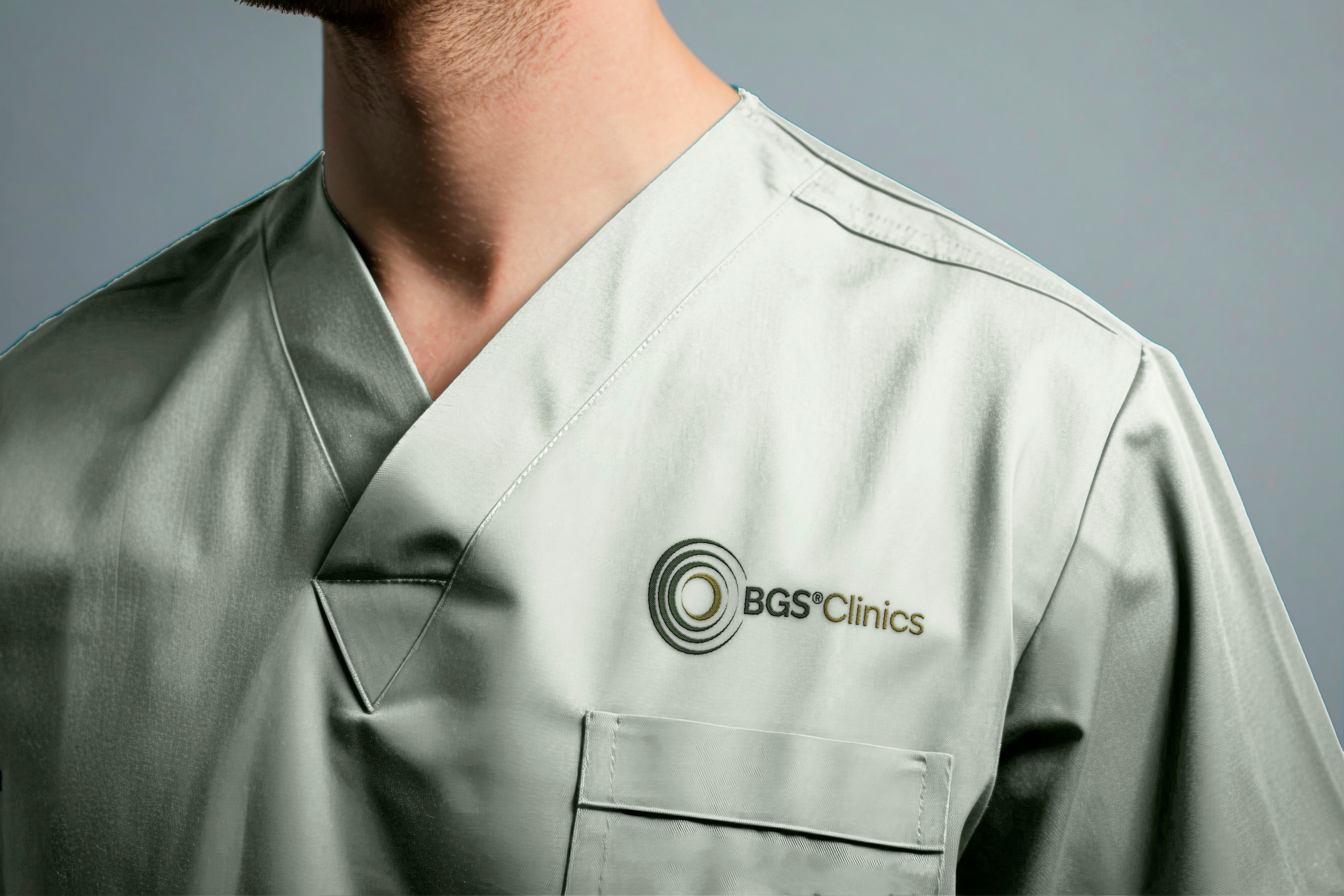
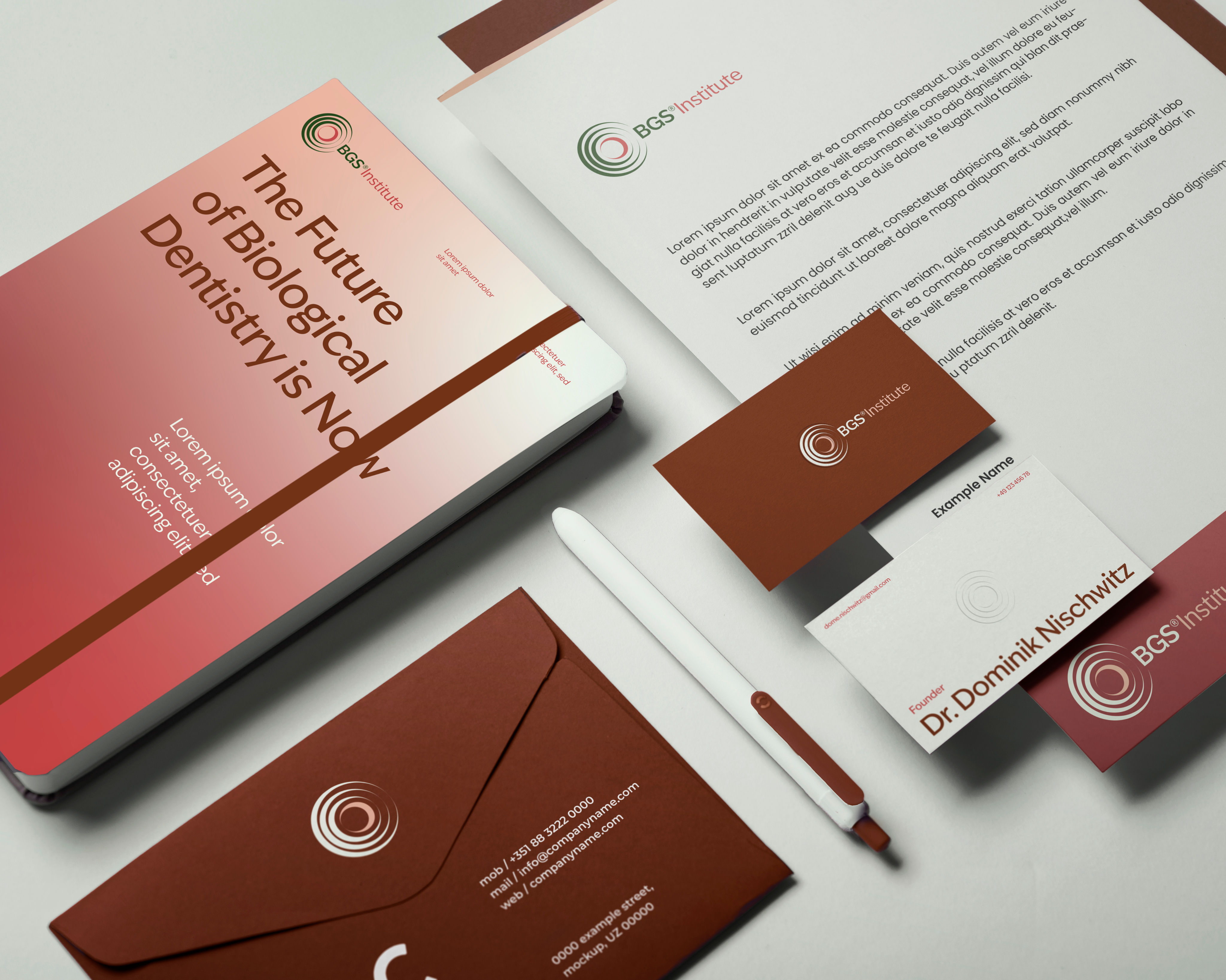
04 Logo
The BGS symbol is designed as an oral fingerprint — evoking the idea of a unique signature for everyone’s oral health.
Its four circular forms can rotate and shift, symbolizing adaptability and continuous movement. This reflects the dynamic, layered nature of systemic health and the idea that everything is connected in a living system.
At its core sits BGS itself: clean, clinical and authoritative. A mark that serves as a seal of quality and a visual gateway into a new standard of care.
Primary logo versions
Inverted logo versions
Clearspace
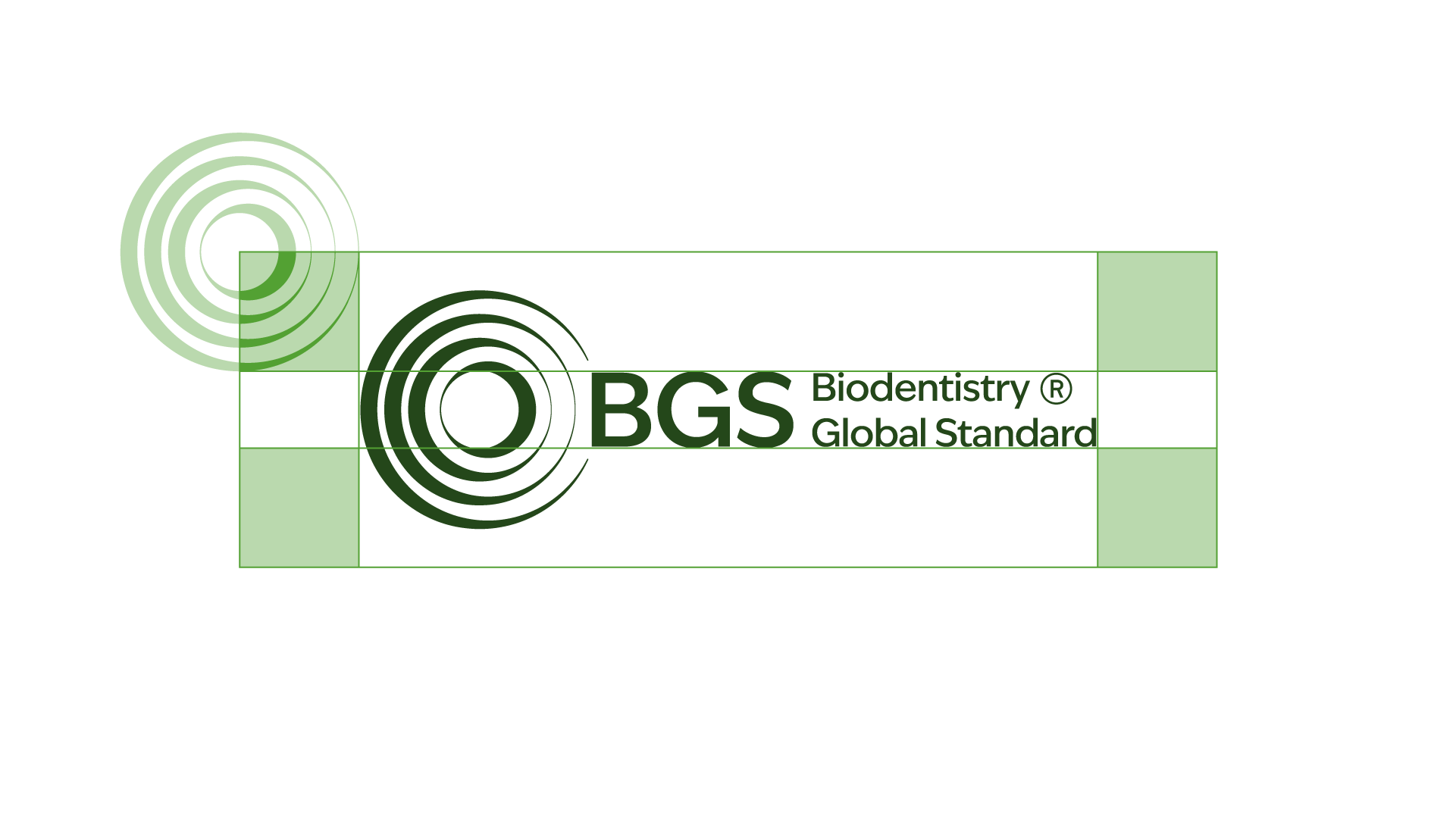
Placement
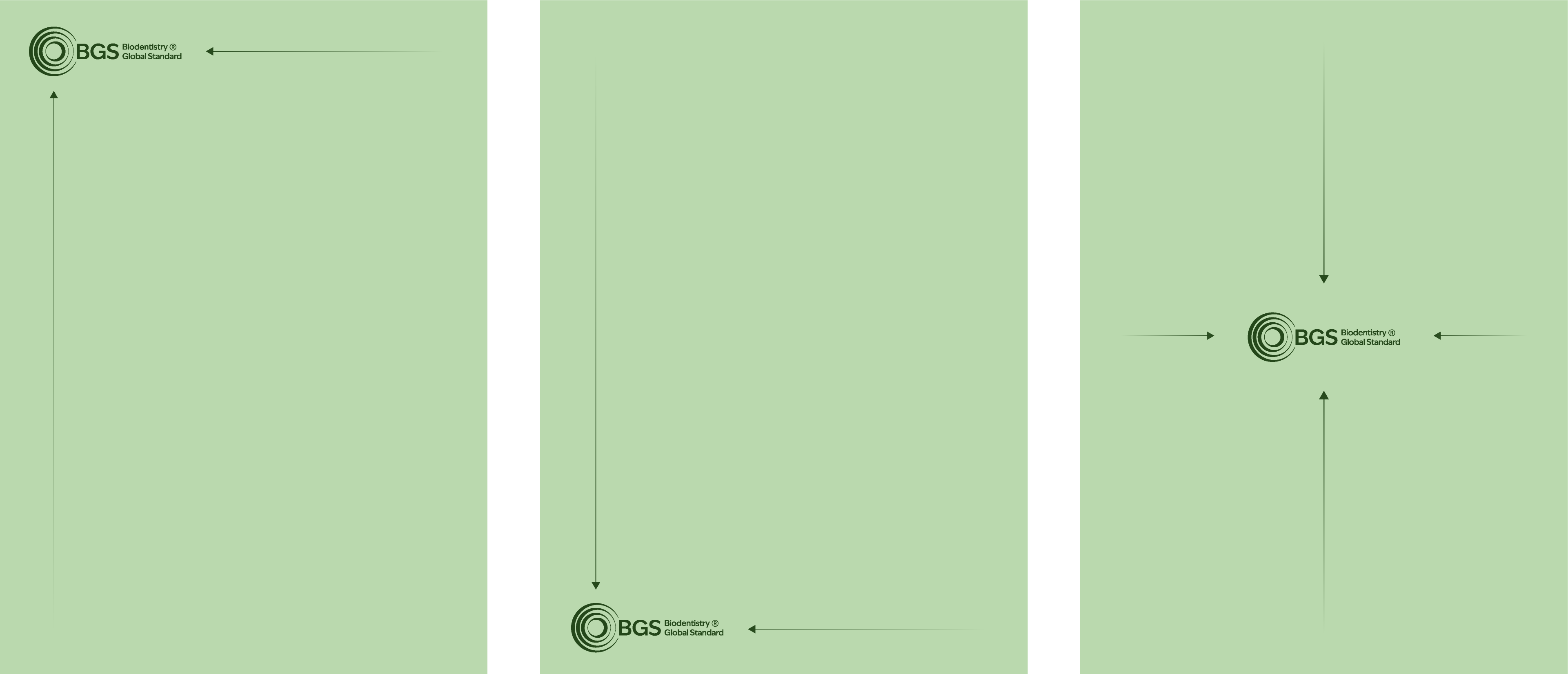
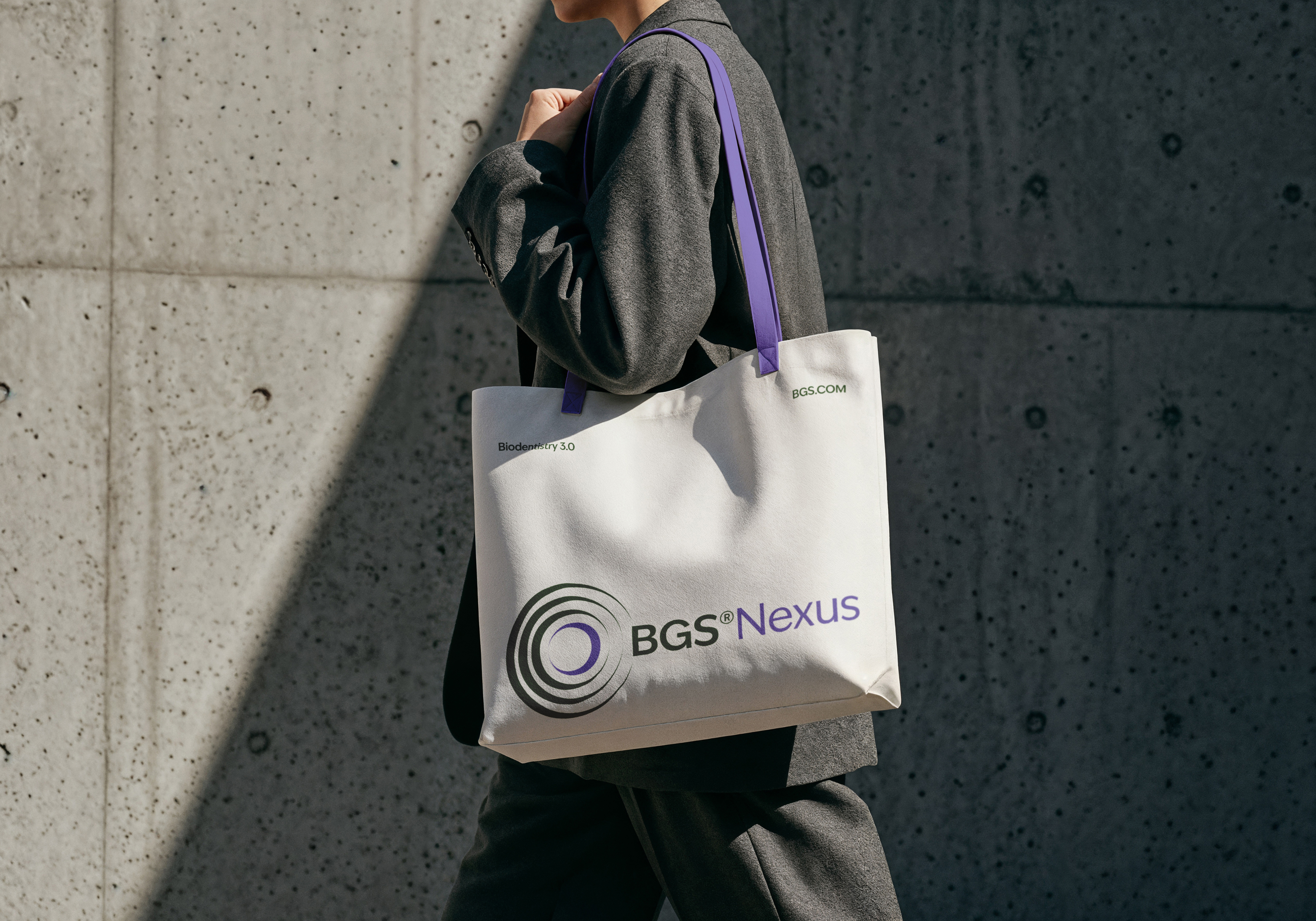
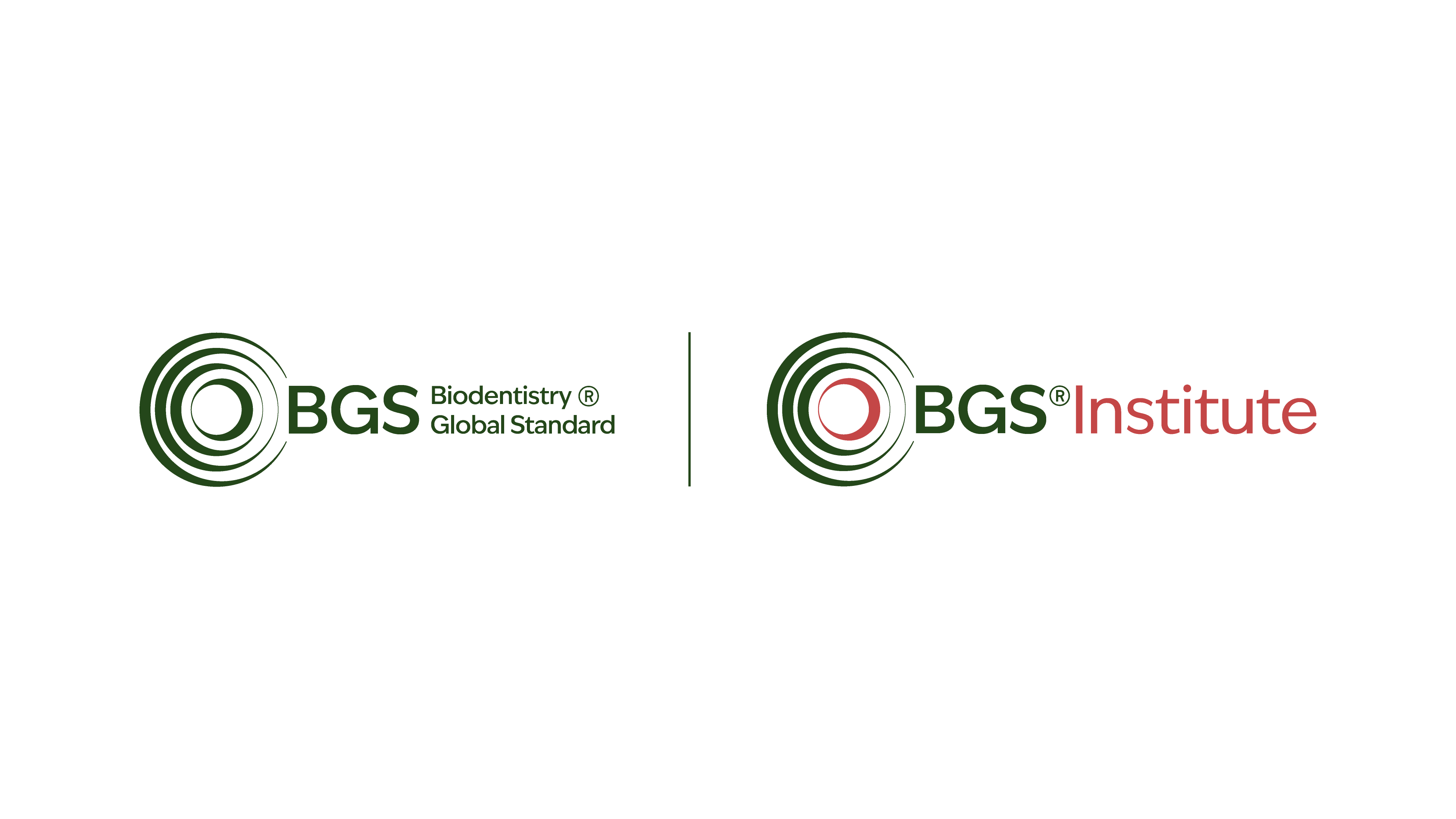
Logo Combinations
When combining two or more BGS logos — such as BGS with BGS Institute, BGS Clinics, or BGS Nexus — the spacing between them follows a fixed rule.
The distance between the two logos is equal to the width of the circular symbol within the BGS logo.
At the midpoint of this distance, a vertical divider line is placed, with a height that exactly matches the height of the circular symbol.
Logos may only be combined horizontally according to these specifications — never stacked or arranged in any other configuration.
The general alignment principles of the BGS logo also apply to all combinations, ensuring a precise and balanced composition across every use case.
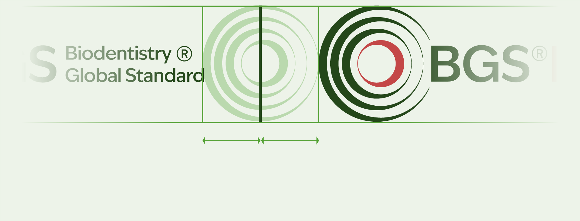
Quality Mark
In addition to the core sub-brands, a refined variant of the BGS logo was developed to serve as a mark of quality, a visual seal used in endorsements, certifications and product integrations across the network.


05 Color
BGS’s color palette is designed to evoke trust, reliability, and financial clarity, ensuring that every touchpoint reflects our commitment to accuracy and efficiency.
Together, these colors create a strong, dependable, and forward-thinking brand identity, ensuring that BGS is instantly recognized as the go-to solution for financial corrections and optimization.
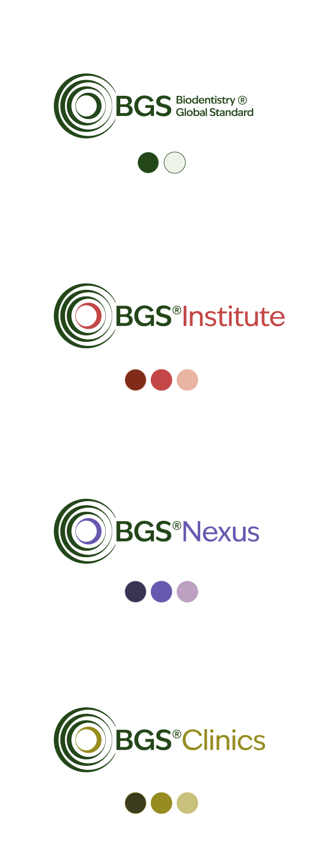
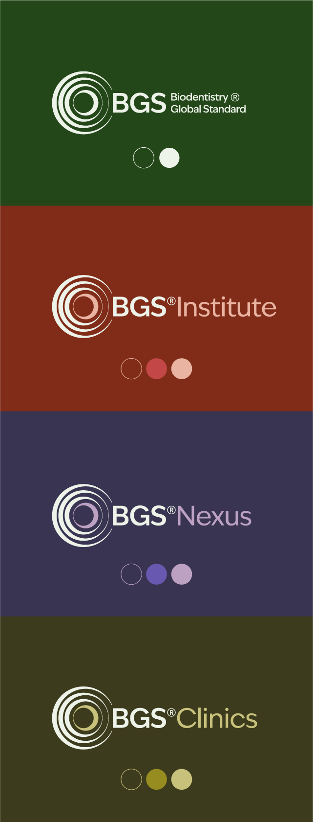
Primary Palette
Hex: #FA9819
Hex: #B6C9CF
Hex: #000000
Hex: #C6EBF7
Sub-brand Specific Palettes


Hex: #802c19
Hex: #c44747
Hex: #e9b4a1


Hex: #393451
Hex: #6958b0
Hex: #bca1c3


Navy
Hex: #3d3b1d
Hex: #968c1f
Hex: #c7c17b
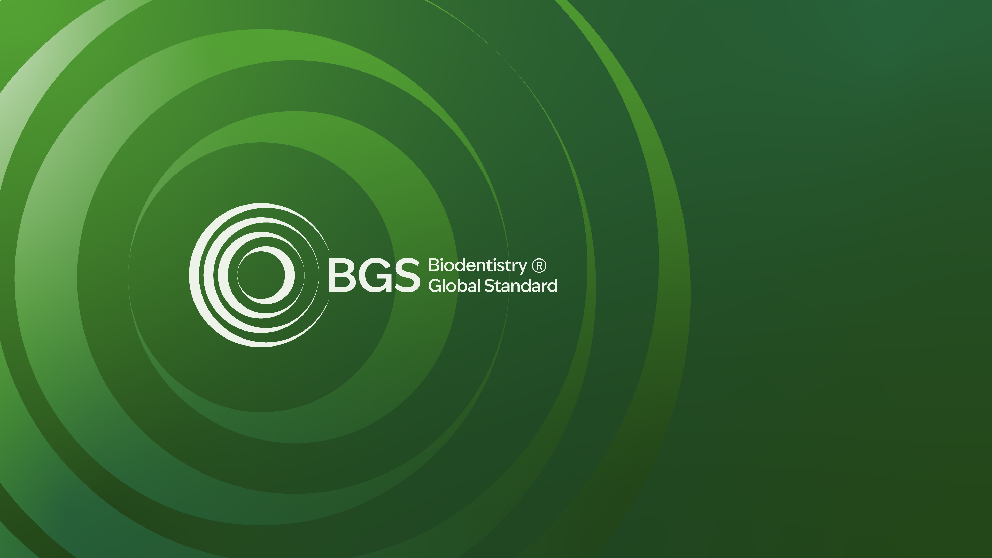
Gradient Palette
Gradients form a key element of the BGS visual language, adding depth and atmosphere to backgrounds across print and digital.
Each sub-brand has its own color palette, and gradients should only be built from those defined colors.
The examples shown here illustrate possible variations—designers are encouraged to explore direction and blending, while keeping the result subtle, balanced, and true to the BGS identity.

BGS

BGS Institute

BGS Nexus

BGS Clinics
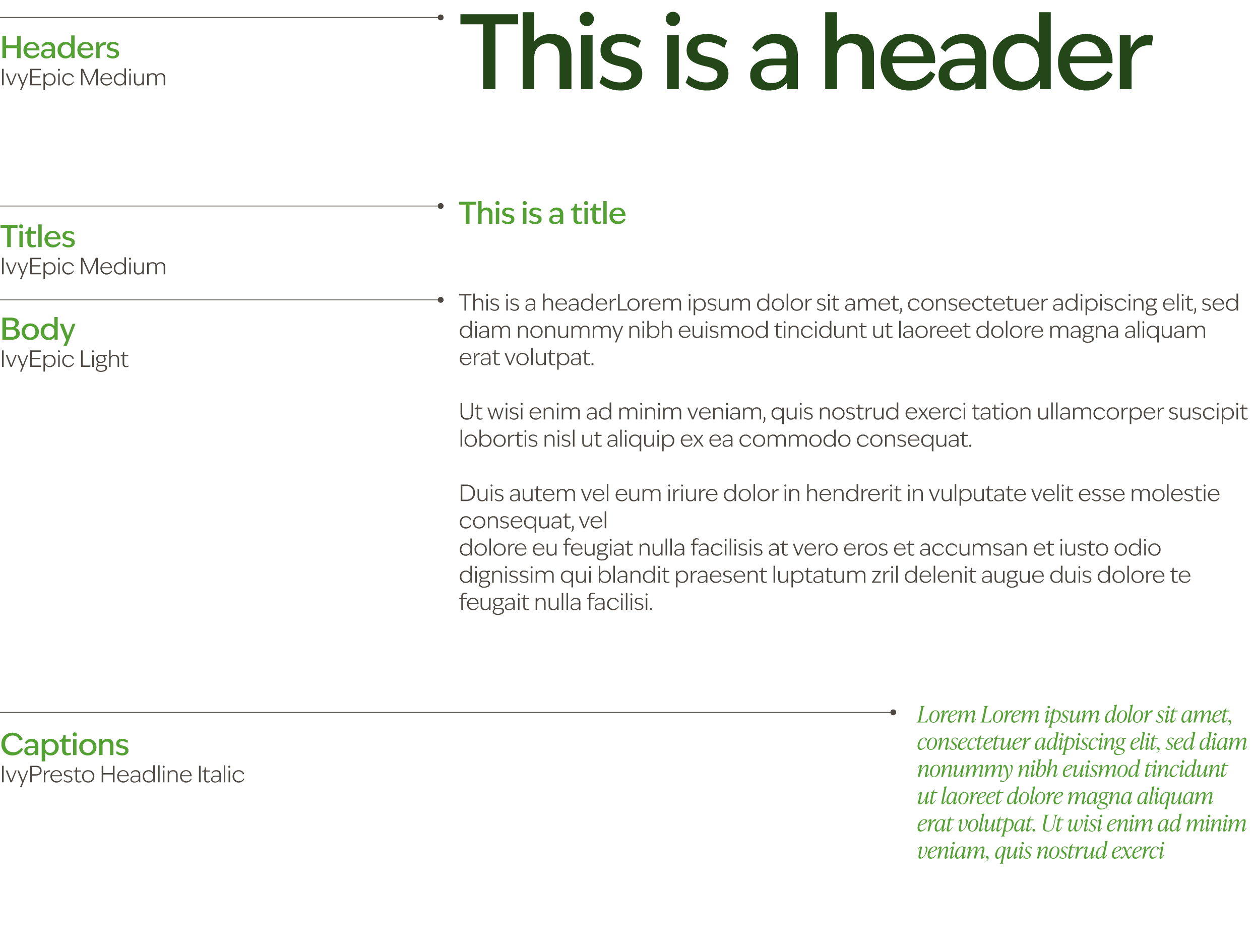
06 Typography
BGS’s typographic system reflects the brand’s balance between science and sophistication — precise, intelligent, and human. The combination of IvyEpic and IvyPresto establishes a timeless visual language that conveys both innovation and trust.
Primary Typeface — IvyEpic
IvyEpic is a modern serif with a confident, architectural rhythm. Its refined letterforms bring clarity and focus to every word, making it ideal for headlines, statements, and brand-defining moments. The typeface embodies the precision and integrity at the core of BGS’s philosophy — analytical yet deeply human.
Secondary Typeface — IvyPresto
IvyPresto complements IvyEpic with an expressive, editorial elegance. Its classic proportions and subtle contrast lend warmth and sophistication to longer texts, printed materials, and storytelling contexts. Used sparingly, it softens the analytical tone and reinforces BGS’s commitment to both knowledge and care.
Together, IvyEpic and IvyPresto form a typographic dialogue — modern yet timeless, technical yet refined — ensuring BGS’s voice remains clear, credible, and distinct across every medium.
Primary Typeface

Secondary Typeface

Sizing
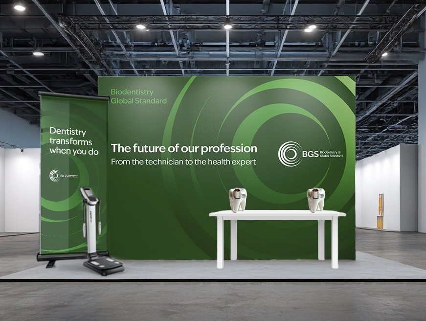
07 Brand in use